Instagram Static 9 Grids: This is the Guide, Y’all
I was hooked as soon as I made my first static grid for Instagram. Since then, I’ve made a ton for clients as one of my core services.
I definitely recommend it for entrepreneurs who are ready to be clear about what you offer, stop feeling pressure to show up every single day on social media, and give potential clients clear and concise directions on how to learn more about what you offer and how to work with you.
If you’re looking at this and feeling overwhelmed: I have a new $500 9 Grid offer where I custom design your grid and my Custom Robot Buddy GPTs walk you through the strategy + captions. I’d love to work with you.
Static Grids Give You Back Time and Mental Space
I deleted the app and haven’t thought about posting to my grid for 3 whole years, which is freaking amazing.
Three years of freedom from feeling like I NEED to create posts and write captions for my Instagram grid has freed up the mental space and energy that I needed to do the things that are really making a difference for me in my business. (You know, that thing where we have to actually make money in our business too.)
Why it Works
#1) It looks SUPER COOL. So people who find me are like, “Woah… what’s this about?” And then they check it out.
#2) Because of the way I’ve set it up, they know EXACTLY what I do and how I can help them. They can see lots of examples of my work and all the testimonials from my happy clients in one place. It’s like a portfolio of my best work. So it really drives home how fun it could be to work with me.
I didn’t stop showing up. I just super-optimized my grid so it acts like a mini-website for me while I focus on other things.
Things Like…
- Having more coffee chats and really connecting with other like-minded business owners
- Being a guest on other people’s podcasts – Like on Business-First Creative with Colie James talking about… Static 9 Grids! 😬
- And being able to (mostly) get off work at 2pm when my kid gets home from school
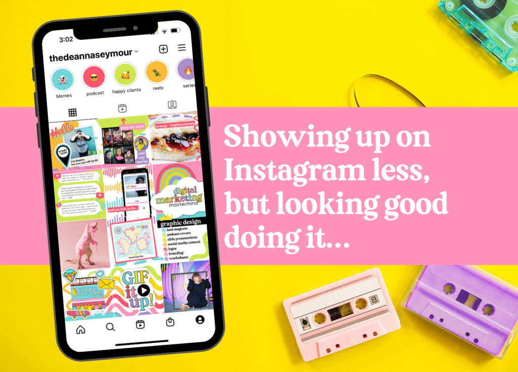
What is a 9 grid for Instagram?
The static 9 grid is nine Instagram posts that overlap and align, so as a matrix of images, it delivers your core messages in a cohesive, branded look. Leave it up for the long term, so that you don’t have to worry about creating posts and instead can focus on Reels and engagement.
- You can create as many as you want; update it for the season, or update single images as you have more news to share.
- As you can see in the screenshot, my first version had 12 posts. But usually, 9 is enough for my clients to highlight the things they want to. Conceivably, you could… keep going, like a long game of Tetris or chutes and ladders.
- Ideally, the images have elements that slightly overlap or flow into each other, so the creative design grabs your eye when they’re viewed altogether – this can really be powerful.
- Order doesn’t matter necessarily, but #1 should definitely be an introduction post. I like to put testimonials in the middle, and the last post to be one last call to action or how to connect with me.
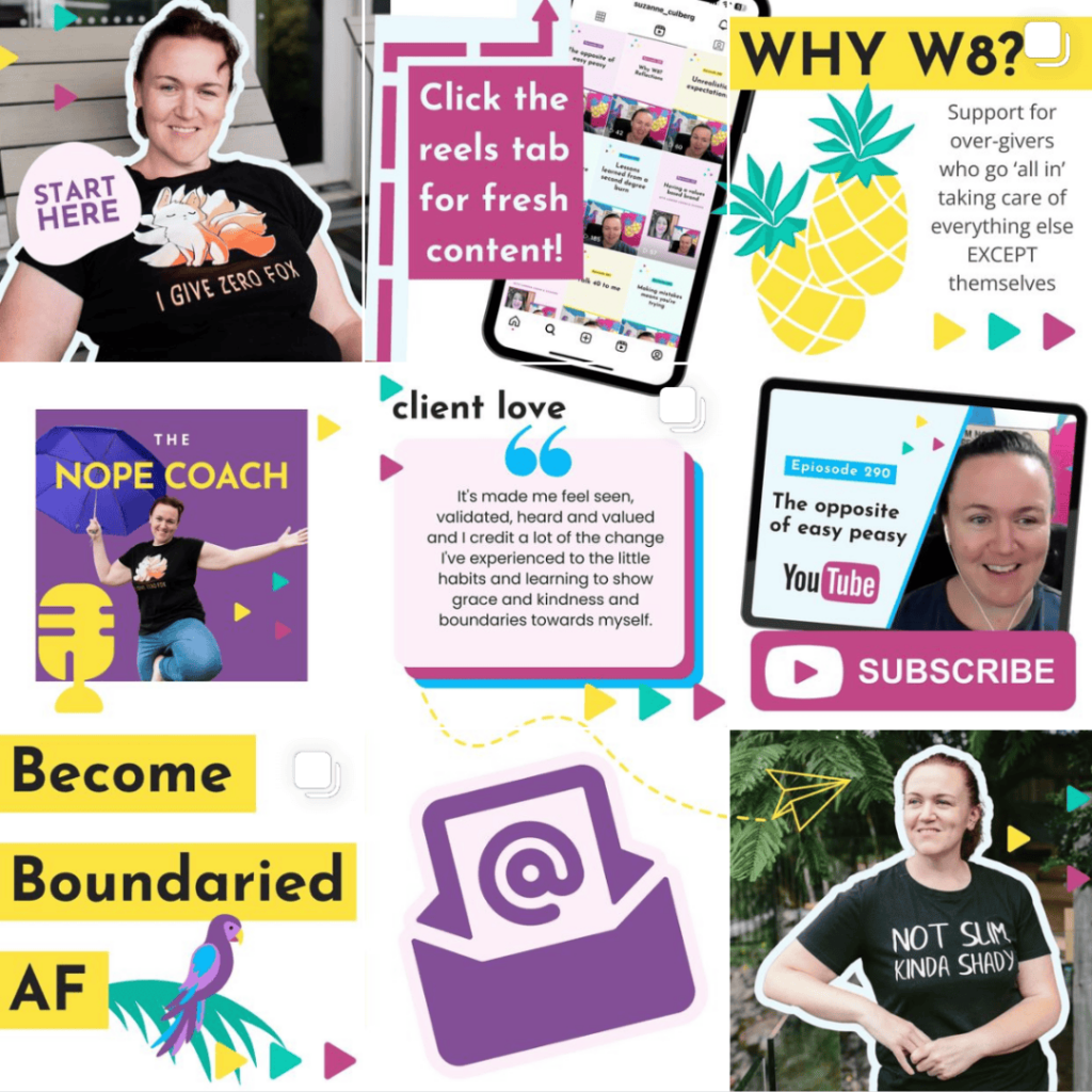
And like I shared with Suzanne Culberg (aka The Nope Coach) on her podcast, you get to decide what works for you! There’s no ONE right way to do things.
Why you might want one
I like to treat the static grid like I used to treat making a mixed tape for a friend back in the day. Remember choosing the most important songs and then making sure they were arranged in a certain way? With an ebb and flow to take the listener on a journey?
Each song could stand on its own, but as a collection… it was an unstoppable work of art. A hand-picked collection of the best songs in the world at that time.
That’s what your static 9 grid should feel like to the person who stumbles upon it over on Instagram. [cue the song Dream Weaver like that scene in Wayne’s World] 🤣 ✨ 💖
Why you might not want one
Maybe you’re not on Instagram at all, and your potential clients aren’t there either. If you’re choosing to invest in a few specific channels, you might not want to sign up for the ‘gram just to put up a 9 grid.
That said, can it hurt? Probably not! So have fun with it if you have the time and energy to do so. If it feels like a distraction, feel free to decline and do something else higher on your priority list.
9 Things you should include in your Static 9 Grid
1. An Introduction Post
I recommend that the first post in the top left should always introduce you. Choose your favorite headshot and write a caption that really sounds like you! I also like to address the fact that you only have a handful of posts, and why that is.
- Maybe you want to run your business with a more anti-hustle approach
- Maybe you love showing up on TikTok or Linkedin or on another platform entirely
- Maybe you really love making Instagram Reels, so you’re gonna hang out there
Just mention that you are aware that you only have a few posts, explain why, and invite them to read through them to get a feel for you and how you can help them.
Think of this first post as an extension of your Instagram bio where you have WAY more words to work with!
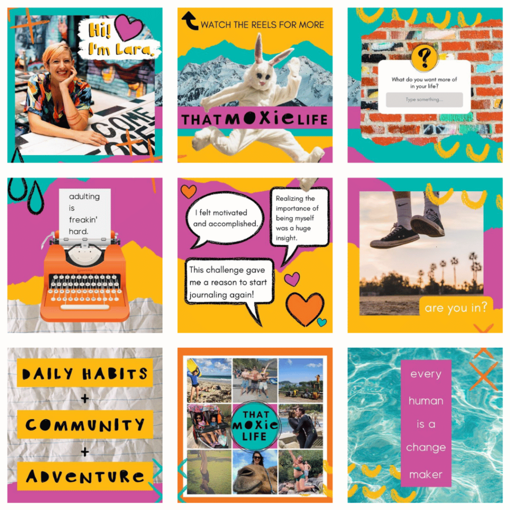
2. An Invitation to Follow
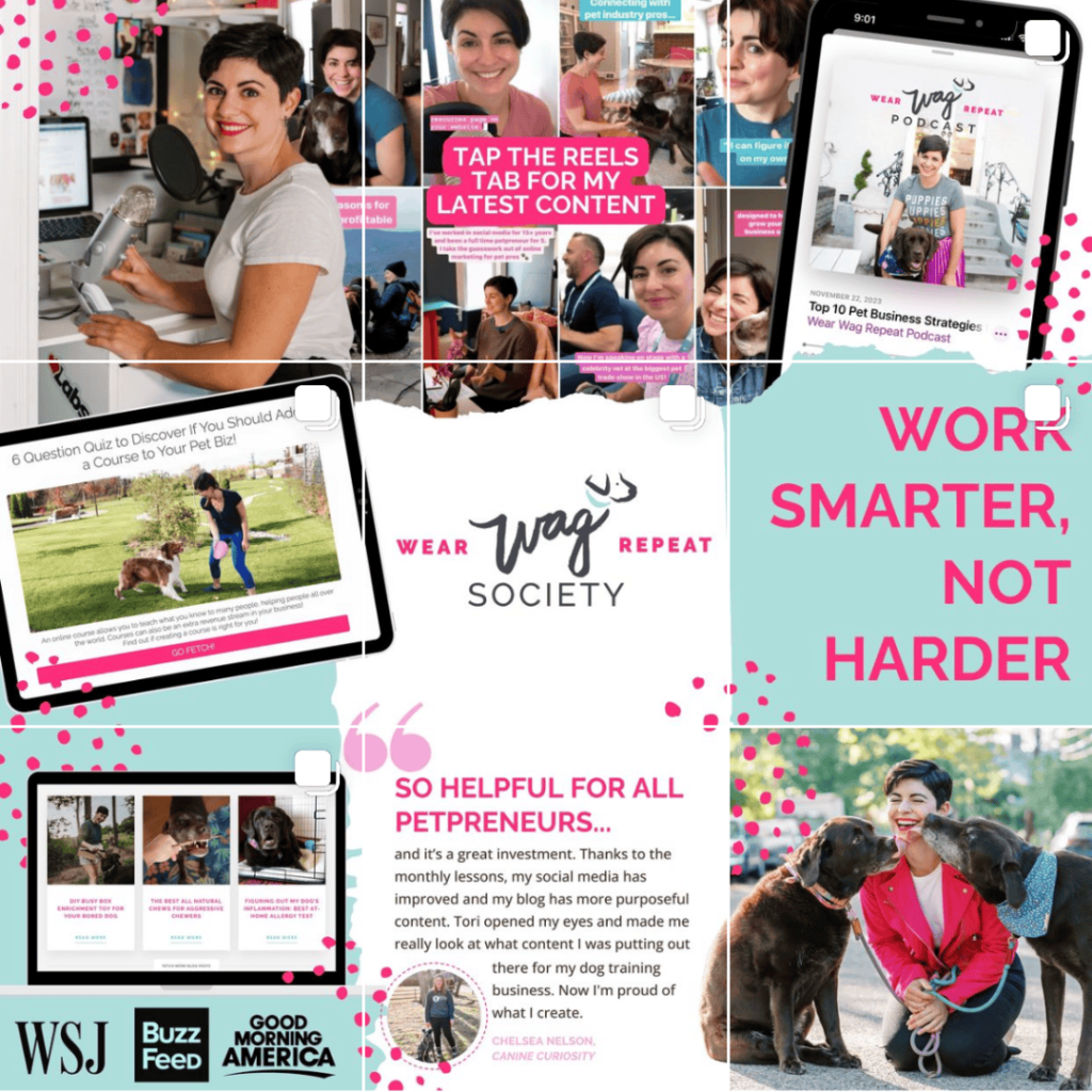
If you’re planning on still showing up in Instagram Reels and/or Stories, I recommend that the second post let the viewer know that. You can use a little arrow in your design to point to the reels tab and let them know to go check out your reels!
Some people might not even know that there’s a reels tab there, so it’s super important to point it out and let them know so they don’t miss your newest content:
3. Your Most Valuable Opt-In
Think about what that might be, a quiz, a PDF, a free course. It looks different for everyone, but you’ll want to highlight your best one or two in your static 9 grid so that you can get people on your email list! That’s the real golden ticket because you own your list. So whatever opt-in you have, should get its own square for sure. Check out this one that includes a Live Event offer.

4. Your Main Offers
The whole point of having a business is to sell your ish, right? So don’t be shy about telling people what you offer. You’ll want to include your main offers. If you sell a signature course, that needs it’s own square. If you have a membership, or do custom work, those will each need a square.
Like I said, it’s different for everyone, but you’ll want to highlight your main offers. Let’s say you have a lot of small workshops. I would create one carousel post about your workshops, and then have them swipe through your most popular ones, with the last slide telling them to click the link in your bio to learn more.
I absolutely LOVE adding carousel posts into a static 9 grid because it’s like little hidden doorways into more information. And, let’s be real: not all people are going to read your captions, so the more you can give them visually, the better!

5. Your Podcast or Podcasts You’ve Guested On
If you have a podcast, definitely dedicate a square to that. And if you don’t have a podcast, but you’ve guested on podcasts, I recommend making a square to shout out your guest spots. You can link to a Spotify playlist in your bio (like this one) so they can go listen to all your interviews in one easy place.
If you have a podcast AND you’ve been on some, I’d think about making a square for each. It’s authority-building gold! And you can turn both of these posts into carousel posts. You can add up to 9 more slides highlighting the shows you’ve been on, or your favorite episodes of your own podcast.
Like these:

6. Client Testimonials
Another opportunity for a carousel post to show off your skills and build some serious clout is in your client testimonials! Gather up all your best quotes from happy clients and create a carousel post that new visitors can easily swipe through to see how amazing your work is.
Here’s a fun static 9 grid I did for Christina Lenkowski. She recently came back for some matching ones for a team member which I also think is a brilliant use of this idea. Every 9 Grid I create gets matching highlight covers and some carousel posts for testimonials, media features, podcast interviews, or whatever else we can come up with:

7. A Call to Action
For the last slide on this one, I love adding a call-to-action for them to book a call with you. I mean, we’re trying to take things to the next level.
One thing I really love about the static 9 grid is that you only have 9(ish) squares so there’s no need to be shy, just tell them how you can help them, and how they can learn more.
8. Talk About What Makes You Different
I like helping my clients add at least one square to talk about what makes them different. Odds are, there are other people out there offering the same services as you. So how do you do it differently?
It’s a great place to talk about your frameworks, things you disagree with in your industry, the main pillars of your program, basically… how you do what you do differently than others in your field.

9. One More Chance To Connect
I like to usually add one more photo of my clients to the last square. Although that isn’t ALWAYS the case. Like I said, everyone’s mission and business, and style is different.
Regardless of whether there’s a photo of you or not in the last square, it’s important to #1 thank the visitor for reading your posts, and #2 remind them where you’ll be for when they’d like to connect more.
If you’ll be in reels and stories, remind them again. If you’d like them to hop on your email list, or go find you on TikTok, Linkedin, Substack, or wherever you hang out. It’s OK to tell them again so hopefully they’ll go find you!

Your Static 9 Grid Graphics Have to Be AWESOME to stand out
When you only have a handful of squares to impress someone, they better be good. Ya feel me? When people stumble upon your 9 grid and it looks like nothing they’ve seen before they’re going to stop and take a few extra beats to see what’s up.
It’s a disruptor to all the things they see every day on social media while they’re scrolling.
When you land on a beautiful static 9 grid it shakes things up and you stop to look. Hopefully, they start poking around. Swiping through your carousel posts. Reading your captions. And by the end, you’ll have a true fan.
“Success” is just as much about repelling your non-fit clients as it is attracting your perfect-fit clients. And I think when you use a template that looks like all the other things they’re seeing every day, it’s hard to do either of those. It just ends up being one more Instagram page in a sea of templates.
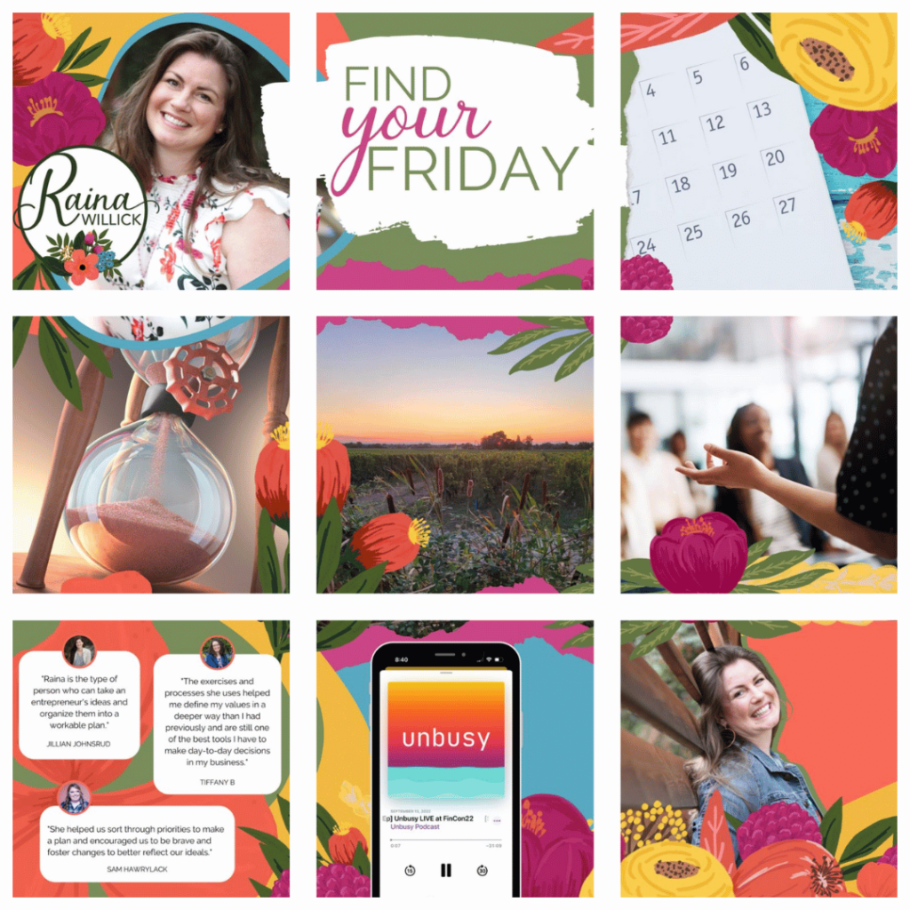
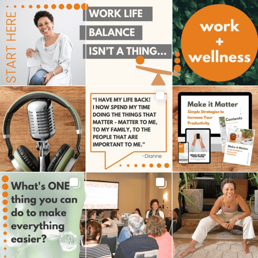
As you can see, all my clients have very different styles, but they all really push the envelope and be bold.
How often to change it
The best part about the static grid is that it’s exactly that – static. You can leave it up as long as you want, but it’s also fun to change it up based on how you’re feeling and what’s happening in your business. Just remember it’s there so that you can spend that energy elsewhere – engaging with your audience, showing up live, or taking an afternoon nap.
- Seasonally: So many fun options to choose from across Winter, Spring, Summer, Fall, traditional and nontraditional holidays, or the seasons in your business.
- Big News: Got something to share? If something big happens in your world, highlight that! A new product launch, a new podcast season, even your new house if that’s the kinda thing you like to share with your audience.
- Big Offers: Holiday sales, new freebies or downloads, partner launches… They’re great reasons to swap out your 9 grid, but you can also cover them in Reels and Lives too.
So what do you think?
Is this something you could see yourself doing in your business? If you’re not ready yet, getting strategic about your 3 pinned posts is a great place to start. And I can help you with that too.
You can learn more about working with me. I’d love to learn more about you and your business and help you breakup with Instagram!
One experimental feed with lots of different shows
close
Thank you for subscribing!